This post explores the tidy Tuesday dataset for 2023-07-04, it is concerned with historical markers in the in The United States. Let’s load the data and take a quick look at it:
Show the code
pacman::p_load(tidyverse,highcharter,leaflet)# Load relevant packages theme_set(theme_minimal())# Set the default theme to minimalhistorical_markers<-readr::read_csv('https://raw.githubusercontent.com/rfordatascience/tidytuesday/master/data/2023/2023-07-04/historical_markers.csv')historical_markers%>%head(5)
# A tibble: 5 × 17
  marker_id marker_no title       subtitle addl_subtitle year_erected erected_by
      <dbl> <chr>     <chr>       <chr>    <chr>                <dbl> <chr>
1     28208 1         Hood’s Mid… "“A Har… The Battle f…           NA City of D…
2     28209 1         Decatur an… "“A Har… The Battle F…           NA City of D…
3     28241 4         “An Affair… "“A Har… The Battle F…           NA City of D…
4     28243 5         Dancy-Polk… "“A Har… The Battle F…           NA City of D…
5     28245 6         Burleson H… "\"A Ha… The Battle F…           NA City of D…
# ℹ 10 more variables: latitude_minus_s <dbl>, longitude_minus_w <dbl>,
#   street_address <chr>, city_or_town <chr>, section_or_quarter <chr>,
#   county_or_parish <chr>, state_or_prov <chr>, location <chr>, missing <chr>,
#   link <chr>
The dataset contains geographical information such as the latitude and longitude coordinates. We also have information about the historical marker, such as where it is located, a brief summary etc. Let’s proceed to pick out a few trends.
2 Data Visualisation
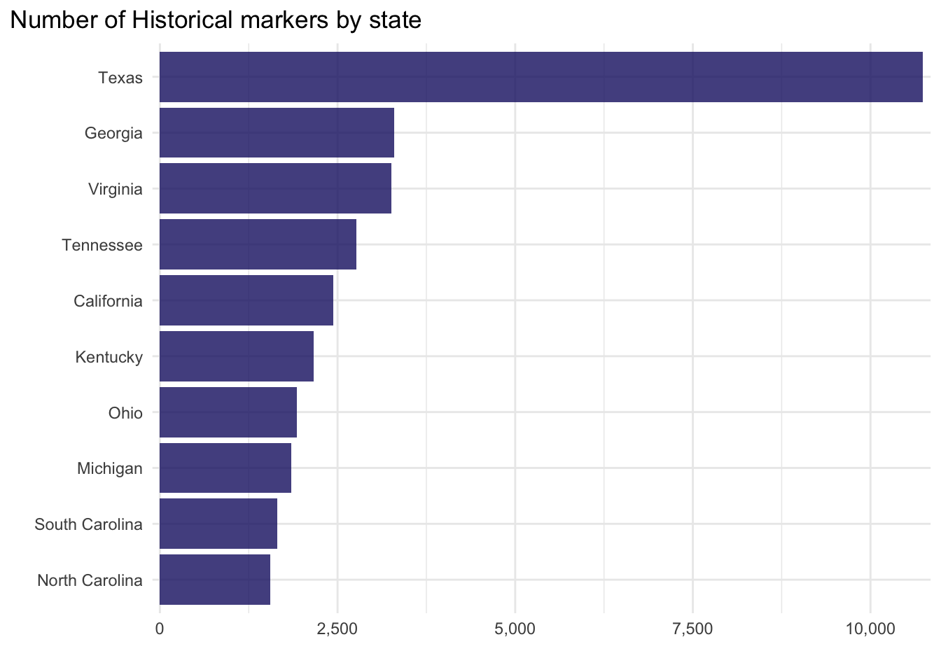
What are the top 10 states with the most historical markers?
Show the code
historical_markers%>%group_by(state_or_prov)%>%count(sort =TRUE,name ="Count")%>%ungroup()%>%slice_head(n =10)%>%ggplot(aes(fct_reorder(state_or_prov,Count),Count))+geom_col(alpha=0.8, fill="midnightblue")+scale_y_continuous(labels =scales::comma_format(), expand =c(0.01,0.01))+xlab("")+ylab("")+coord_flip()+theme(plot.title.position ="plot")+ggtitle(label ="Number of Historical markers by state")
Let’s plot the number of historical markers on a map using a continuous scale, to create a choropleth map:
Show the code
historical_markers%>%group_by(state_or_prov)%>%count(sort =TRUE,name ="Count")%>%ungroup()->hist_countmapdata<-get_data_from_map(download_map_data("custom/usa-and-canada"))# glimpse(mapdata)mapdata%>%filter(country=="United States of America")->mapdatahcmap("countries/us/us-all", data =hist_count, value ="Count", joinBy =c("name", "state_or_prov"), name ="Number of Historical Markers", dataLabels =list(enabled =TRUE, format ="{point.name}"), borderColor ="black", borderWidth =0.1, tooltip =list())%>%hc_title( text="Historical Markers by State")%>%hc_colorAxis( minColor ="#fbf2ff", maxColor ="#7300a7")%>%hc_mapNavigation(enabled =TRUE)
Again we see the same pattern in the first visual, but now projected onto a map. You can even zoom in if you wish to do so. It looks like Texas has the most historical markers, a total of 10,741. It would be interesting to see the locations of the markers as points, given how many there are we can also cluster them to identify hot spots:
Show the code
historical_markers%>%filter(state_or_prov=="Texas")%>%# Filter for Texas onlyselect(title,latitude_minus_s,longitude_minus_w)->Texas_histleaflet(Texas_hist)%>%addTiles()%>%addMarkers(~longitude_minus_w,~latitude_minus_s,clusterOptions =markerClusterOptions(), label =~title,popup =~title)
Again we can zoom in and out top get a sense of the geographical distribution of the markers. The northernmost historical marker is The Oslo Community in contrast the southernmost marker is the Raab Plantation. What other patterns can you find in the data? What are the eastern and westernmost historical markers in Texas?
Source Code
---title: "Historical Markers in The United States"title-block-banner: trueformat: html: code-fold: true code-summary: "Show the code" code-tools: true toc: true number-sections: true highlight-style: githublink-citations: trueimage: "map.jpg"---# Loading the dataThis post explores the tidy Tuesday dataset for `2023-07-04`, it is concerned with historical markers in the in The United States. Let's load the data and take a quick look at it:```{r, message=FALSE}pacman::p_load(tidyverse,highcharter,leaflet) # Load relevant packages theme_set(theme_minimal()) # Set the default theme to minimalhistorical_markers <- readr::read_csv('https://raw.githubusercontent.com/rfordatascience/tidytuesday/master/data/2023/2023-07-04/historical_markers.csv')historical_markers %>%head(5)```The dataset contains geographical information such as the latitude and longitude coordinates. We also have information about the historical marker, such as where it is located, a brief summary etc. Let's proceed to pick out a few trends.# Data VisualisationWhat are the top 10 states with the most historical markers?```{r, message=FALSE}historical_markers %>%group_by(state_or_prov) %>%count(sort =TRUE,name ="Count") %>%ungroup() %>%slice_head(n =10) %>%ggplot(aes(fct_reorder(state_or_prov,Count),Count))+geom_col(alpha=0.8, fill="midnightblue")+scale_y_continuous(labels = scales::comma_format(), expand =c(0.01,0.01))+xlab("")+ylab("")+coord_flip()+theme(plot.title.position ="plot")+ggtitle(label ="Number of Historical markers by state")```Let's plot the number of historical markers on a map using a continuous scale, to create a choropleth map:```{r, message=FALSE}historical_markers %>%group_by(state_or_prov) %>%count(sort =TRUE,name ="Count") %>%ungroup() -> hist_countmapdata <-get_data_from_map(download_map_data("custom/usa-and-canada"))# glimpse(mapdata)mapdata %>%filter(country =="United States of America") ->mapdatahcmap("countries/us/us-all",data = hist_count,value ="Count",joinBy =c("name", "state_or_prov"),name ="Number of Historical Markers",dataLabels =list(enabled =TRUE, format ="{point.name}"),borderColor ="black",borderWidth =0.1,tooltip =list()) %>%hc_title(text="Historical Markers by State" ) %>%hc_colorAxis(minColor ="#fbf2ff",maxColor ="#7300a7" ) %>%hc_mapNavigation(enabled =TRUE)```Again we see the same pattern in the first visual, but now projected onto a map. You can even zoom in if you wish to do so. It looks like Texas has the most historical markers, a total of 10,741. It would be interesting to see the locations of the markers as points, given how many there are we can also cluster them to identify hot spots:```{r, message=FALSE}historical_markers %>%filter(state_or_prov =="Texas") %>%# Filter for Texas onlyselect(title,latitude_minus_s,longitude_minus_w) -> Texas_histleaflet(Texas_hist) %>%addTiles() %>%addMarkers(~longitude_minus_w,~latitude_minus_s,clusterOptions =markerClusterOptions(), label =~title,popup =~title)```Again we can zoom in and out top get a sense of the geographical distribution of the markers. The northernmost historical marker is *The Oslo Community* in contrast the southernmost marker is the *Raab Plantation*. What other patterns can you find in the data? What are the eastern and westernmost historical markers in Texas?