In order to make visualisation easier we are going to convert the data into long format, using the pivot_longer function:
Show the code
average_cost%>%pivot_longer(cols =gas_mwh:wind_mwh,names_to ="type",values_to ="cost")%>%mutate(flag =if_else(type=='solar_mwh', 'top', false ='bottom'))->average_cost#Assign to a new variableaverage_cost%>%select(-flag)
The wrangled data is now far more suitable for visualisation.
3 Visualise the data
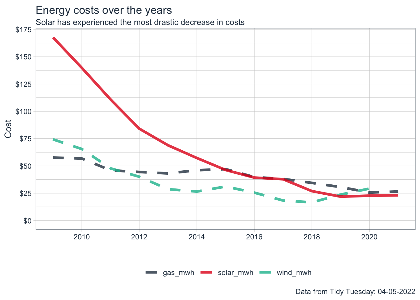
Let’s visualise the data looking at the costs over time for each of the energy sources.
Show the code
average_cost%>%ggplot(aes(year,cost,color=type))+geom_line(aes(linetype=flag), size=1.5,alpha =0.8)+scale_x_continuous(breaks =seq(2008, 2022, by =2))+scale_y_continuous(labels =scales::dollar_format(), breaks =seq(0,175,by=25))+tidyquant::theme_tq()+expand_limits(y=0)+guides(linetype="none")+scale_linetype_manual(values =c("dashed","solid"))+labs( x="", y="Cost", title ="Energy costs over the years", subtitle ="Solar has experienced the most drastic decrease in costs", caption ="Data from Tidy Tuesday: 04-05-2022")+tidyquant::theme_tq()+tidyquant::scale_color_tq()+theme(legend.title =element_blank())->plot1plot1
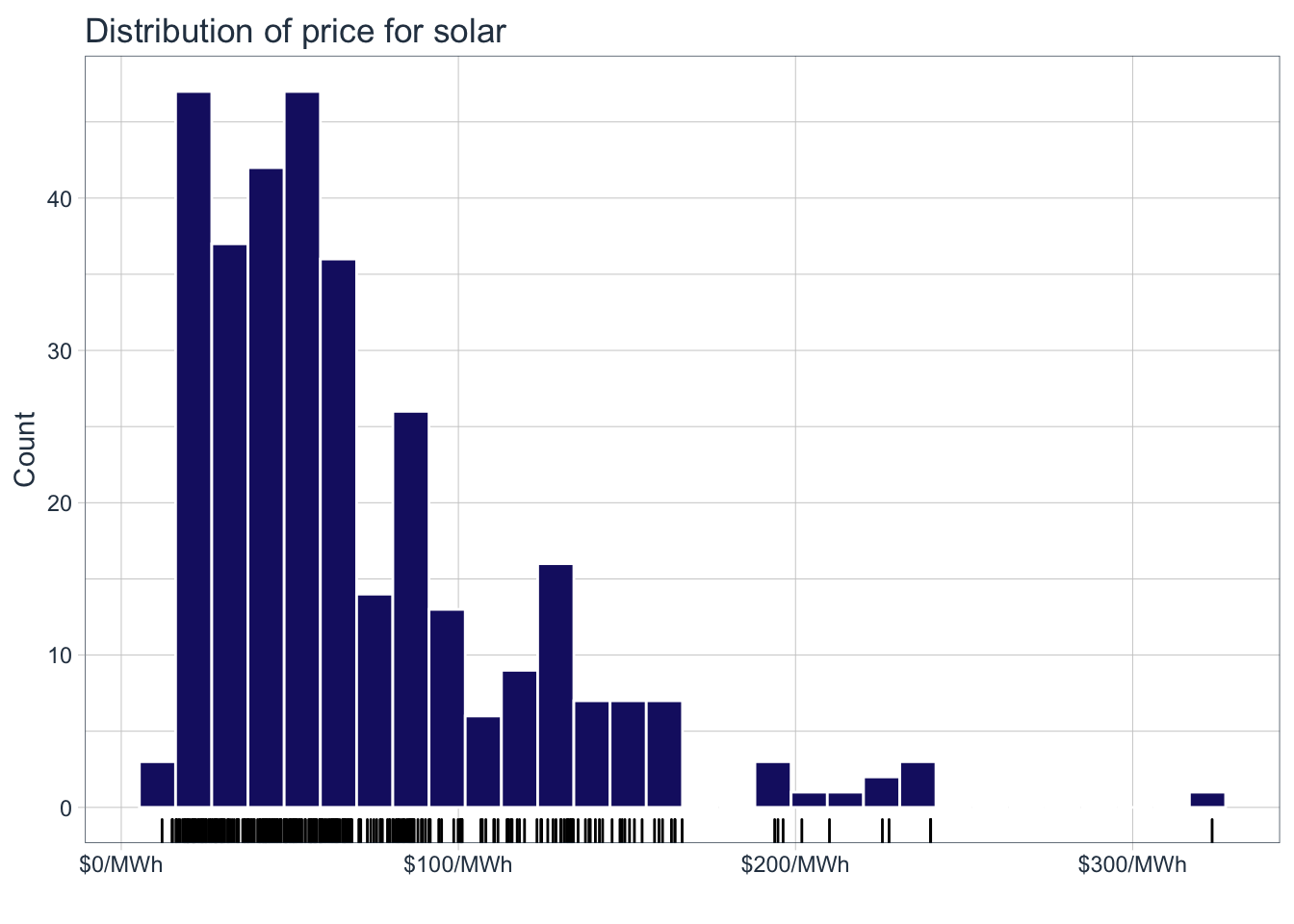
We can see that in solar has experienced the most drastic decrease in costs for the available date ranges in the data. Let’s get a sense of the spread of the prices for solar:
Show the code
solar%>%ggplot(aes(solar_mwh))+geom_histogram(color ='white', fill ='midnightblue')+geom_rug()+labs( title ="Distribution of price for solar", x ="", y="Count")+scale_x_continuous(labels =scales::dollar_format(suffix ="/MWh"))+# scale_y_continuous(expand = c(0,0), limits = c(0,50))+tidyquant::theme_tq()->plot2plot2
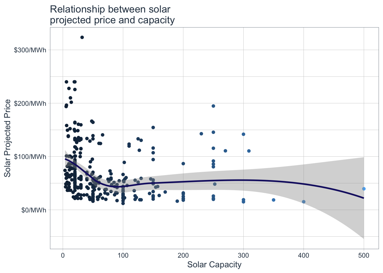
The prices for solar energy vary from 12/MWh to just above 300/MWh, the majority between 12 and 100. Let’s also try to understand the relation ship between $/MWh and solar capacity.
Show the code
solar%>%ggplot(aes(solar_capacity,solar_mwh, color=solar_capacity))+geom_jitter()+geom_smooth(color='midnightblue')+tidyquant::theme_tq()+theme(legend.position ="none")+scale_color_continuous(name ='Wind Capacity')+scale_y_continuous(labels =scales::dollar_format(suffix ="/MWh"))+labs( x="Solar Capacity", y="Solar Projected Price", title ="Relationship between solar\nprojected price and capacity")->plot3plot3
The relationship is not too strong, but at an overall level we can say that the price decreases as solar capacity increases, up to a certain point where it seems to stabilise.
4 Bring it all together
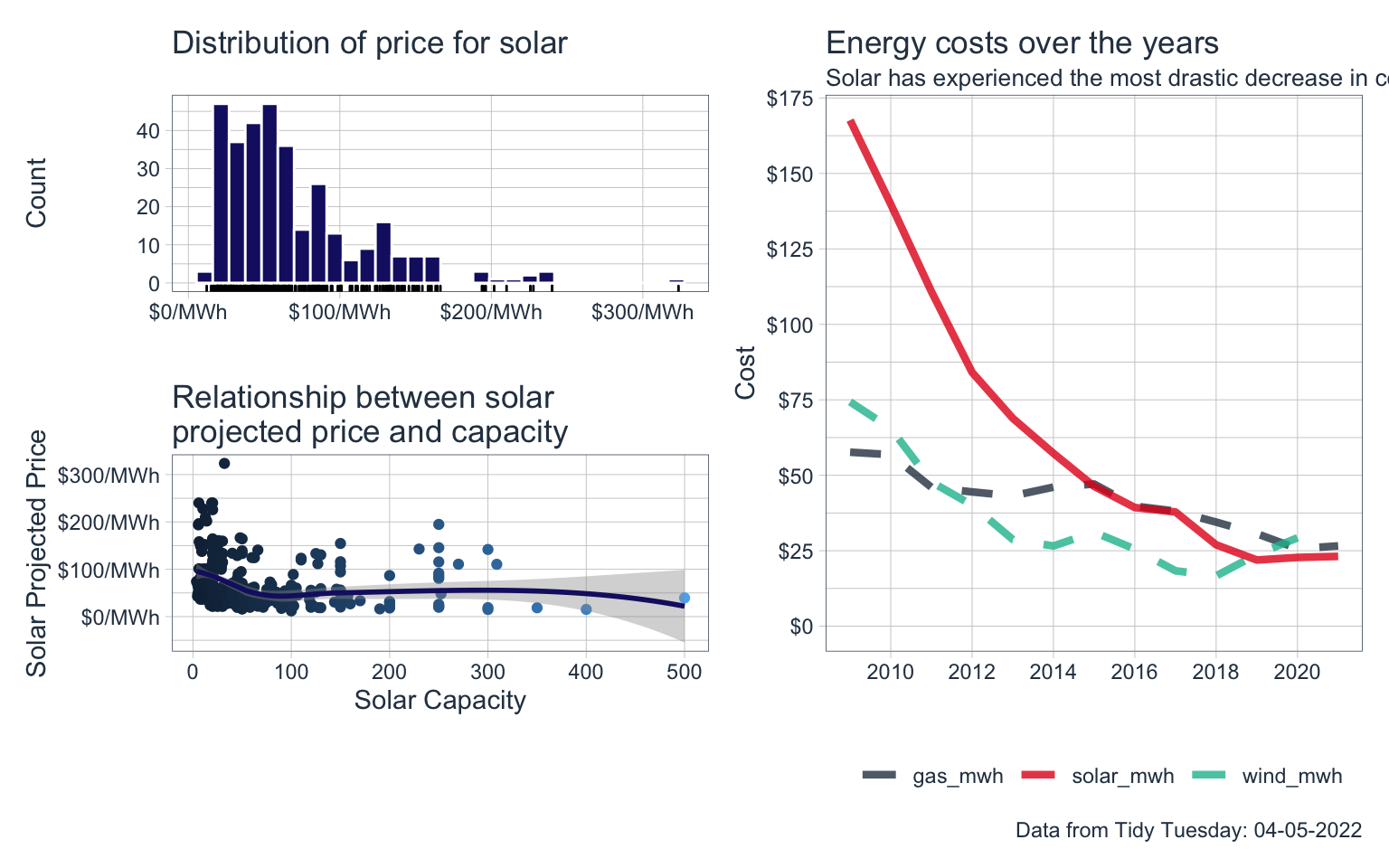
Let’s bring all of these visualisations together using the patchwork package:
---title: "Exploring Energy Capacity and Prices"title-block-banner: trueformat: html: code-fold: true code-summary: "Show the code" code-tools: true toc: true number-sections: true highlight-style: githublink-citations: trueimage: "energy_prices.png"---# Loading the dataThis post revisits an older Tidy Tuesday dataset, it is concerned with capacity and costs for solar and wind energy.```{r, message=FALSE}pacman::p_load(tidyverse)capacity <- readr::read_csv('https://raw.githubusercontent.com/rfordatascience/tidytuesday/master/data/2022/2022-05-03/capacity.csv')wind <- readr::read_csv('https://raw.githubusercontent.com/rfordatascience/tidytuesday/master/data/2022/2022-05-03/wind.csv')solar <- readr::read_csv('https://raw.githubusercontent.com/rfordatascience/tidytuesday/master/data/2022/2022-05-03/solar.csv')average_cost <- readr::read_csv('https://raw.githubusercontent.com/rfordatascience/tidytuesday/master/data/2022/2022-05-03/average_cost.csv')```# Cleaning the dataLet's take a look at the average cost data:```{r}average_cost %>%head(5)```In order to make visualisation easier we are going to convert the data into long format, using the `pivot_longer` function:```{r}average_cost %>%pivot_longer(cols = gas_mwh:wind_mwh,names_to ="type",values_to ="cost") %>%mutate(flag =if_else(type =='solar_mwh', 'top', false ='bottom')) -> average_cost #Assign to a new variableaverage_cost %>%select(-flag)```The wrangled data is now far more suitable for visualisation.# Visualise the dataLet's visualise the data looking at the costs over time for each of the energy sources.```{r, warning=FALSE, message=FALSE}average_cost %>%ggplot(aes(year,cost,color=type))+geom_line(aes(linetype=flag), size=1.5,alpha =0.8)+scale_x_continuous(breaks =seq(2008, 2022, by =2))+scale_y_continuous(labels = scales::dollar_format(), breaks =seq(0,175,by=25))+ tidyquant::theme_tq()+expand_limits(y=0)+guides(linetype="none")+scale_linetype_manual(values =c("dashed","solid"))+labs(x="",y="Cost",title ="Energy costs over the years",subtitle ="Solar has experienced the most drastic decrease in costs",caption ="Data from Tidy Tuesday: 04-05-2022")+ tidyquant::theme_tq()+ tidyquant::scale_color_tq()+theme(legend.title =element_blank()) -> plot1plot1```We can see that in solar has experienced the most drastic decrease in costs for the available date ranges in the data. Let's get a sense of the spread of the prices for solar:```{r, message = FALSE, warning=FALSE}solar %>%ggplot(aes(solar_mwh) )+geom_histogram(color ='white',fill ='midnightblue')+geom_rug()+labs(title ="Distribution of price for solar",x ="",y="Count" ) +scale_x_continuous(labels = scales::dollar_format(suffix ="/MWh")) +# scale_y_continuous(expand = c(0,0), limits = c(0,50))+ tidyquant::theme_tq() -> plot2plot2```The prices for solar energy vary from 12/MWh to just above 300/MWh, the majority between 12 and 100. Let's also try to understand the relation ship between \$/MWh and solar capacity.```{r, message=FALSE,warning=FALSE}solar %>%ggplot(aes(solar_capacity,solar_mwh, color=solar_capacity))+geom_jitter()+geom_smooth(color='midnightblue')+ tidyquant::theme_tq()+theme(legend.position ="none")+scale_color_continuous(name ='Wind Capacity') +scale_y_continuous(labels = scales::dollar_format(suffix ="/MWh"))+labs(x="Solar Capacity",y="Solar Projected Price",title ="Relationship between solar\nprojected price and capacity") -> plot3plot3```The relationship is not too strong, but at an overall level we can say that the price decreases as solar capacity increases, up to a certain point where it seems to stabilise.# Bring it all togetherLet's bring all of these visualisations together using the `patchwork` package:```{r, message=FALSE, warning=FALSE, fig.height=5, fig.width= 8}library(patchwork)((plot2/plot3|plot1))```